|
|||||||||||||||||||||||||||||||||
Allégez le kaki - conseil de Solomon J. Solomon au ministère de la Guerre
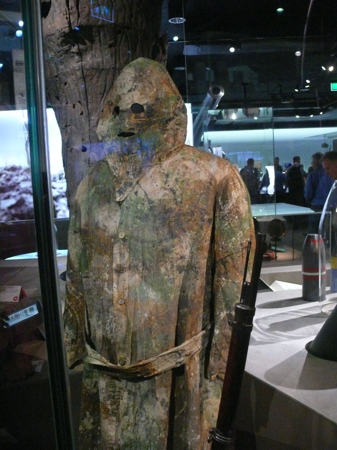
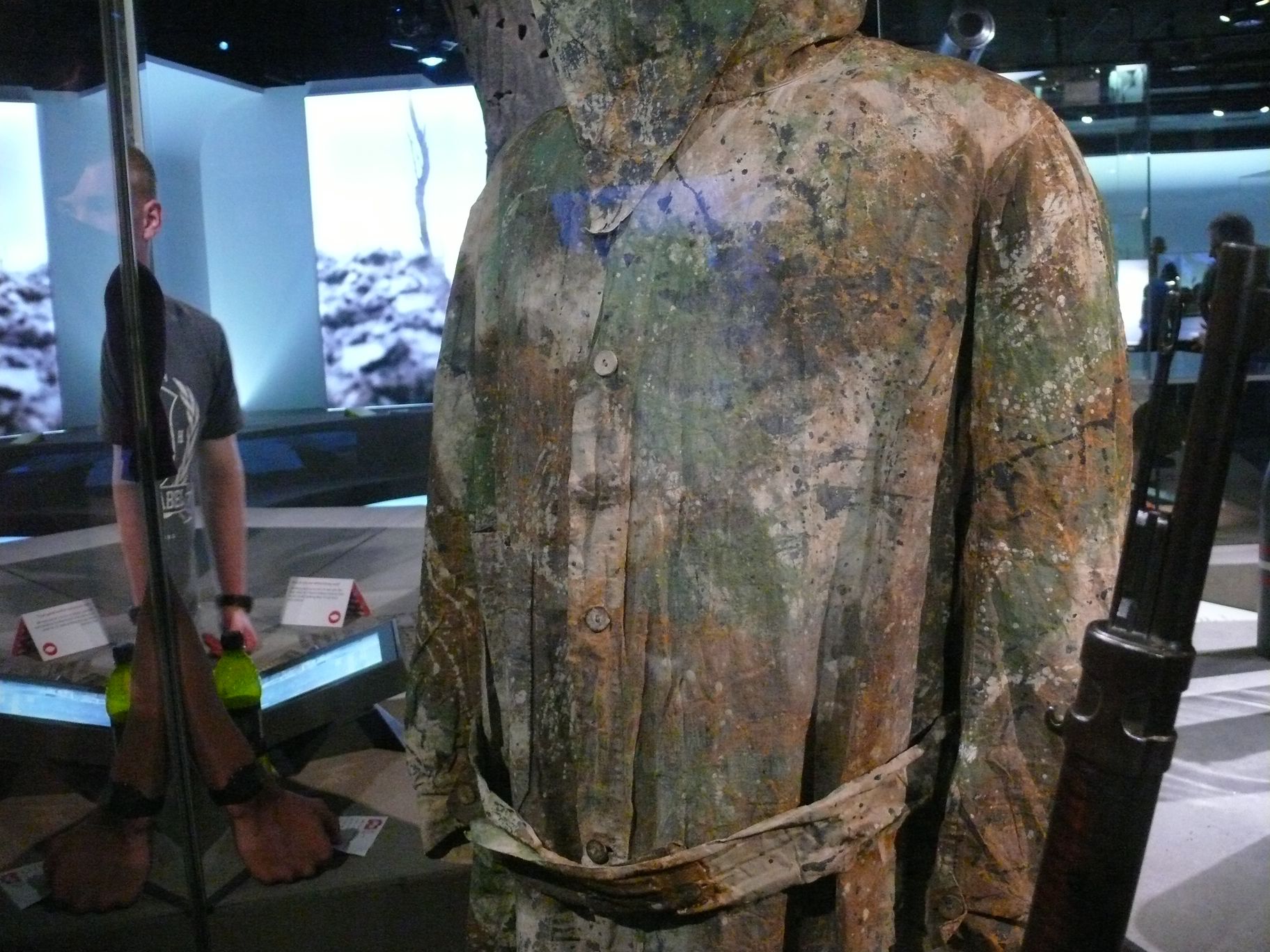
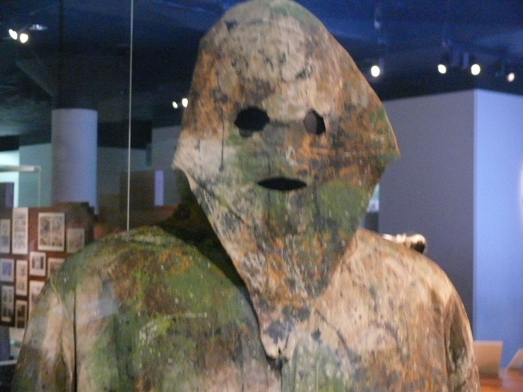
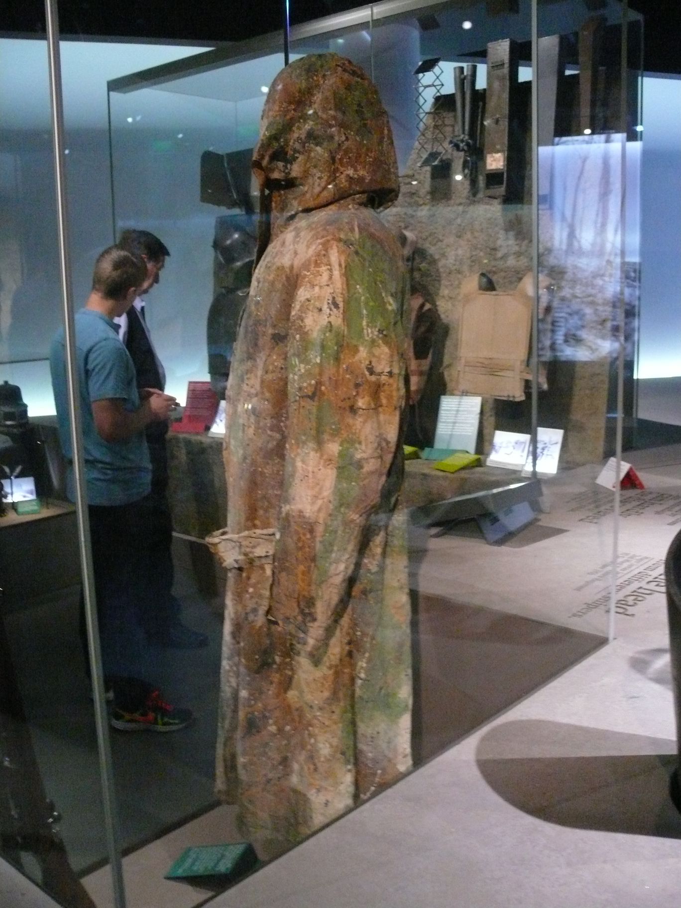
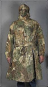
Lighten up on the khaki – Solomon J. Solomon’s advice to the War Department Comments & Replies ‘It has to be remembered that throughout this war our men are moving in a more or less easterly direction…’ Solomon J. Solomon was a prominent Anglo-Jewish artist and portrait painter who went on to pioneer various schemes of camouflage in the First World War. It was in this letter to the editor of The Times, published on 27 January, 1915, that he first indicated the contribution that artists might make to a war in which traditional methods of concealment had been invalidated by the coming of aerial photography. Here applied to the question of military uniform, his novel recommendations are indebted to the idea of ‘countershading’ developed by the American artist Abbott H. Thayer in the earlier study, Concealing Coloration in the Animal Kingdom (1909). Solomon’s letter is followed by another, written by an ‘artist and big-game shot’ who signed himself ‘W.W.’, and printed two days later. According to the Oxford English Dictionary, the word ‘camouflage’ did not enter English usage until 1917. UNIFORM AND COLOUR (letter to the editor, The Times, 27 January 1915, p. 9) Sir, – The protection afforded animate creatures by Nature’s gift of colour assimilation to their environment might provide a lesson to those who equip an army; seeing that invisibility is an essential in modern strategy. To be invisible to the enemy is to be non-existent for him. Our attempts in this direction might well be a little more scientific. A knowledge of light and shade and its effect on the landscape is a necessary aid to the imagination of a designer of the uniform in particular, and the appurtances of war in general.For instance, the khaki tunic is good in summer – in winter it is too yellow – but the same colour cloth clads the whole man. Here a knowledge of light and shade comes in. The planes parallel to the source of light are the lightest, and they darken as they recede from that light source. The top of the head and the shoulders in grey daylight are the lightest planes. The body is a shade lower in tone. The legs recede from the body and are lower in tone still. Moreover, they are seen either in column of route or in the individual as a dark silhouette against the ground, which, next to the sky is the lightest plane in the landscape. To obviate these adverse changes of tone it becomes necessary to clothe the lower limbs in a much lighter stuff than the body, and the cap and shoulders – the shoulder straps would suffice – in a darker, taking the tunic to be the normal tone aimed at. The boots also could be made of the greenish leather now used for body straps, or covered with light spats. Such an arrangement of colour tone obtains in many animals, birds and fish to render them less visible to their natural enemies. Any part of the uniform casting a definite shadow is objectionable. To detach a figure from its background the painter has only to put a touch a tone darker or lighter than any in its setting to effect it. The cap now worn detaches the men in this way from almost any setting and affords a most excellent target for the enemy marksman. The short tunic sins in the same direction by casting a marked shadow on the legs. This could be avoided by the use of a long coat buttoned back at the knees for marching, with a stiffening introduced to prevent flapping. The movement of the legs is the first thing that catches the eye, even at a great distance. The cap should be helmet-shaped, with a visor that could be lowered over part of the face – the motive for this need not be dwelt upon – and if made of leather or woven wire would afford protection from shrapnel. Colour uniformity is inexpedient. If in each meeting the colour of the tunic or coat varied between the excellent winter blue of the Guards’ great-coat, a gray-green, and the present khaki, a broken effect of colouring would be obtained with advantage. It is perhaps impossible to arrange for all conditions, but we have now seen the uniform in summer, autumn, and winter, and are in a position to judge of its value in many and varied effects. It has to be remembered that throughout this war our men are moving in a more or less easterly direction, and for the greater part of the day will have the sun at their backs. For this reason all colours should tend to light rather than dark, that they may take on as much reflected light as possible and so neutralize the depth of shadow into which they will be cast. The artillery officer is covering his gun with grey tarpaulin, but with a team of six or eight horses in front of it, the airman is not likely to mistake it for a butcher’s cart. The horses have merely to be covered with a thin grey-green stuff to make them equally inconspicuous. Wagons are a leaden grey, unlike anything in nature; a warm dust colour would be more harmonious. A similar observation applies to warships. The North Sea is almost invariably a pearly green, and experiments with models should evolve something more subtle than their metallic hue. Artists, I feel certain, would be only too pleased to place their knowledge and experience at the disposal of the authorities. They discuss these matters among themselves, but so far there is no useful connecting link between the makers of the arts of peace and the designers of the munitions of war. Yours obediently, S.J.S. UNIFORM AND COLOUR (letter to the editor, The Times, 29 January, 1915, p. 9) Sir, – There is one point ‘S.J.S.’ has left out of his letter, with which I entirely agree otherwise. That is the importance of breaking up the outline. However well the tone of the clothing of a man is made to agree with its surroundings, the outline of the man is apt to show. Now, as an artist and big-game shot, I have found that if the waistcoat is one colour, the coat another, the leg coverings another, &c., its outline is less easy to make out. For instance, if lying down in a Scotch deer-forest waiting for deer – if the cap is the colour of a stone, the coat a peat hag, the knickerbockers grass colour, the stockings and boots black, to represent the exposed peat, if the man keeps still he looks not like one object, but an agglomeration of a small stone, peat hag, patch of grass, and a piece of exposed peat. The face is the difficulty, and that can be got over by wearing a veil, green or grey. I have walked close up to a man dressed as I have described and his face covered with a long bag veil of grey without noticing him, although he was the very man I was trying to find, when out deer stalking. The great thing, next to protective colouring, is breaking up the outline. I suppose rifle barrels get rusty, or else it would be as well to paint them grey or green, as they are apt to flash.
|
|
Droit d’auteur La plupart des photographies publiées sur ce site sont la propriété exclusive de © Claude Balmefrezol Elles peuvent être reproduites pour une utilisation personnelle, mais l’autorisation préalable de leur auteur est nécessaire pour être exploitées dans un autre cadre (site web publications etc) Les sources des autres documents et illustrations sont mentionnées quand elles sont connues. Si une de ces pièces est protégée et que sa présence dans ces pages pose problème, elle sera retirée sur simple demande. Principaux Collaborateurs:
Nb
de visiteurs:9411670 Nb
de visiteurs aujourd'hui:1548 Nb
de connectés:35
| |||||||||||||||||||||||||||||||


.JPG)
.JPG)
.JPG)